Back in April 2020, we introduced two new indexes – the Cornell Capital Group (CCG) Quarantine Index and the CCG anti-Quarantine index. The Quarantine Index was composed of what might be called, stay at home, work at home stocks. Typical companies were Amazon, Zoom, Netflix and Grubhub. The anti-Quarantine Index was composed of get up and go places stocks such as airlines, hotels, restaurant changes, and movie theater companies.
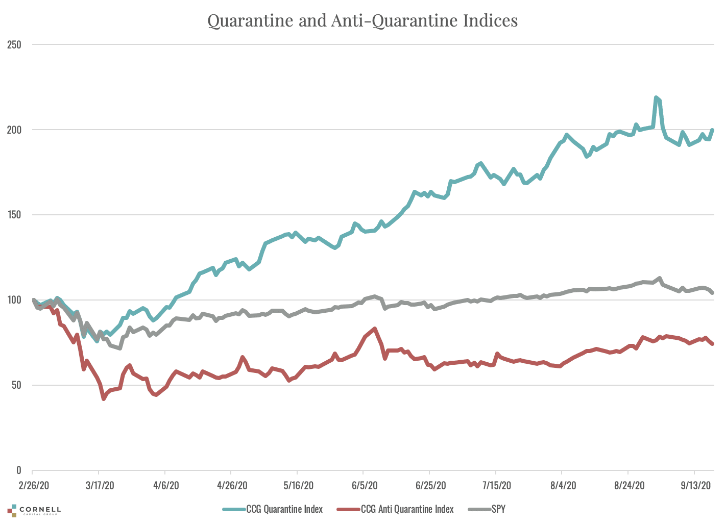
In mid-May 2020 we compared the performance of the two indexes beginning on February 26, 2020 when the virus crisis descended on the market. At that point in time the difference between the two indexes was dramatic. The Quarantine Index was up almost 40 percent, whereas the anti-Quarantine Index was down over 40 percent. From the perspective of mid-May, it would have been reasonable to assume that the damage had been done and the gap was not likely to expand further. By that time, the market was aware of all the economic problems caused by the virus. In fact, as time passed and the possibility of a vaccine grew, one might guess that the gap would narrow slightly. What in fact happened? The two graphs below answer that question.
The first graph plots the Quarantine Index and the anti-Quarantine Index along with the S&P 500. These are price indexes which do not include dividends. The graph shows that in the months following May the Quarantine continued to rise. Whereas it was up 40% in May, by the close on September 19, 2020 it was up almost 100% from February 26. By the end of May the decline in the anti- Quarantine Index was largely over. In the months following, the general trend was up, but the path was volatile. Despite the small bounce back, the anti-Quarantine Index was still down about 30% at the end of the period. Finally, over the full period, the S&P 500 ended up close to where it began on February 26.
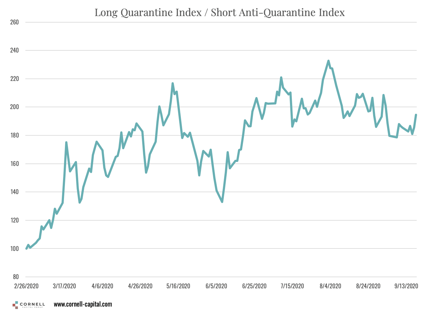
To get a better picture of the relation between the two indexes, the second graph plots the performance of a portfolio that is long the Quarantine Index and short the anti-Quarantine Index. There two things of note. The first is that the portfolio performance hits a peak of nearly 220 in May and is largely flat after that implying that the performance of the two indexes was approximately equal. That fact is obscured in the first graph because the level of the Quarantine Index is so much higher than the anti- Quarantine Index.
The second feature is the volatility of the portfolio which is notably greater than that for either of the individual indexes. The high volatility is due to a negative correlation between the two indexes caused by virus related news. Consider, for instance, a day on which there was “bad” virus related news. During the time period in question, such news typically led to an increase in the Quarantine Index and a drop in the anti-Quarantine Index. Because the portfolio is long the Quarantine Index and short the ani- Quarantine Index the two effects compound. Similarly, on days with “good” virus new such as positive vaccine results, the returns again compound with the anti- Quarantine Index being the one that goes up. These results imply that an equity investor concerned about reducing risk should hold both Quarantine Index and anti- Quarantine Index stocks so that the two offset rather than reinforce in response to virus related news.
The foregoing also implies that the two indexes are useful tools for interpreting news regarding Covid-19. By tracking the daily percentage changes in the Quarantine and anti- Quarantine Index investors can gain a deeper understanding of how the virus is affecting the market. We have made available a chart of the indexes that is updated daily at market close at www.cornell-capital.com/quarantine-indexes.


