The performance of the market was remarkable in the second quarter. Driven by the Magnificent 7 tech stocks, for which the total return was 16.5%, the total return for the S&P 500 was 4.3%. What was remarkable was not the gain per se, the returns were healthy but by no means unprecedented, but the valuation level from which they occurred and the fact that seven companies more than accounted for the entire increase. At the start of the quarter the Shiller CAPE (cyclically adjusted price-earnings) ratio was 33.14, a level exceeded only during the stock market booms of 1929, 2000, and 2021. And yet the market rose from there. For some this implies a “strong market,” and they expect the strength will lead to further gains. For those of us who focus on valuation, it means the market has become even more expensive implying meager future long-run returns.
In our first quarter memo, we analogized the relation between the stock market and economic fundamentals (economic growth and corporate profits) as similar to a water skier (the market) attached to a boat (economic fundamentals) by a very flexible bungee cord. When the cord is contracting the skier can move a good deal faster than the boat and perhaps even race by it. However, eventually the skier must stall to allow the boat to pull ahead and begin to put tension on the cord. No matter what the short-run gyrations, however, in the long run the path of the skier is determined by the movement of the boat. We noted that in recent times the skier had been moving a good deal faster than the boat. In the second quarter, this continued due almost exclusively to the performance of the Mag 7 tech stocks. If something cannot go on forever it must stop. It is hard for us to see this going much further. Hopefully, it will end with the market stalling out and not sinking.
The water skier analogy and common sense implies that as stocks become more expensive relative to earnings or cash flows, that future stock returns are likely to be lower. But what do the data say? Insight can be gained by using the comprehensive data from Prof. Shiller’s website. Using that data we constructed three scatter plots and associated regression lines. The first relates the level of Prof. Shiller’s CAPE index to the return on the S&P 500 the following year; the second relates the CAPE to the average annual return over the next five years; and the third relates the CAPE to the average annual return over the next ten years.
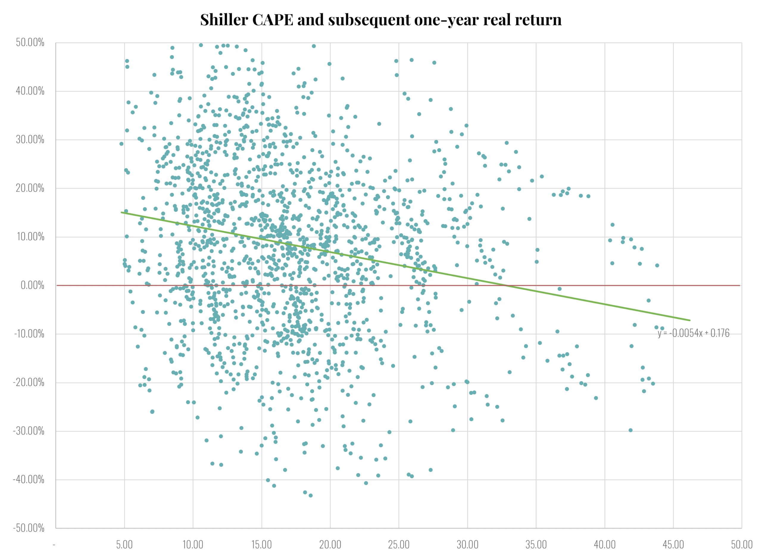
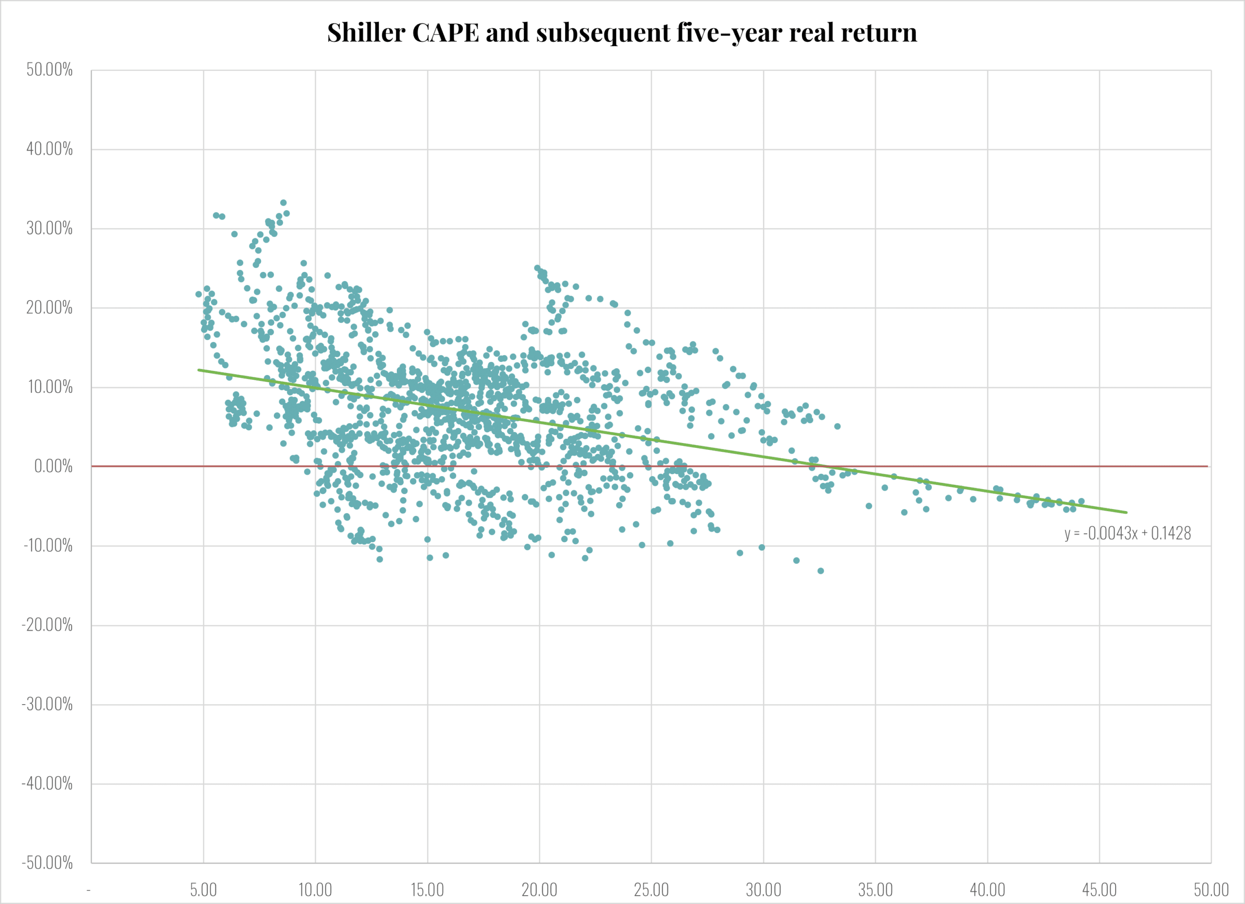
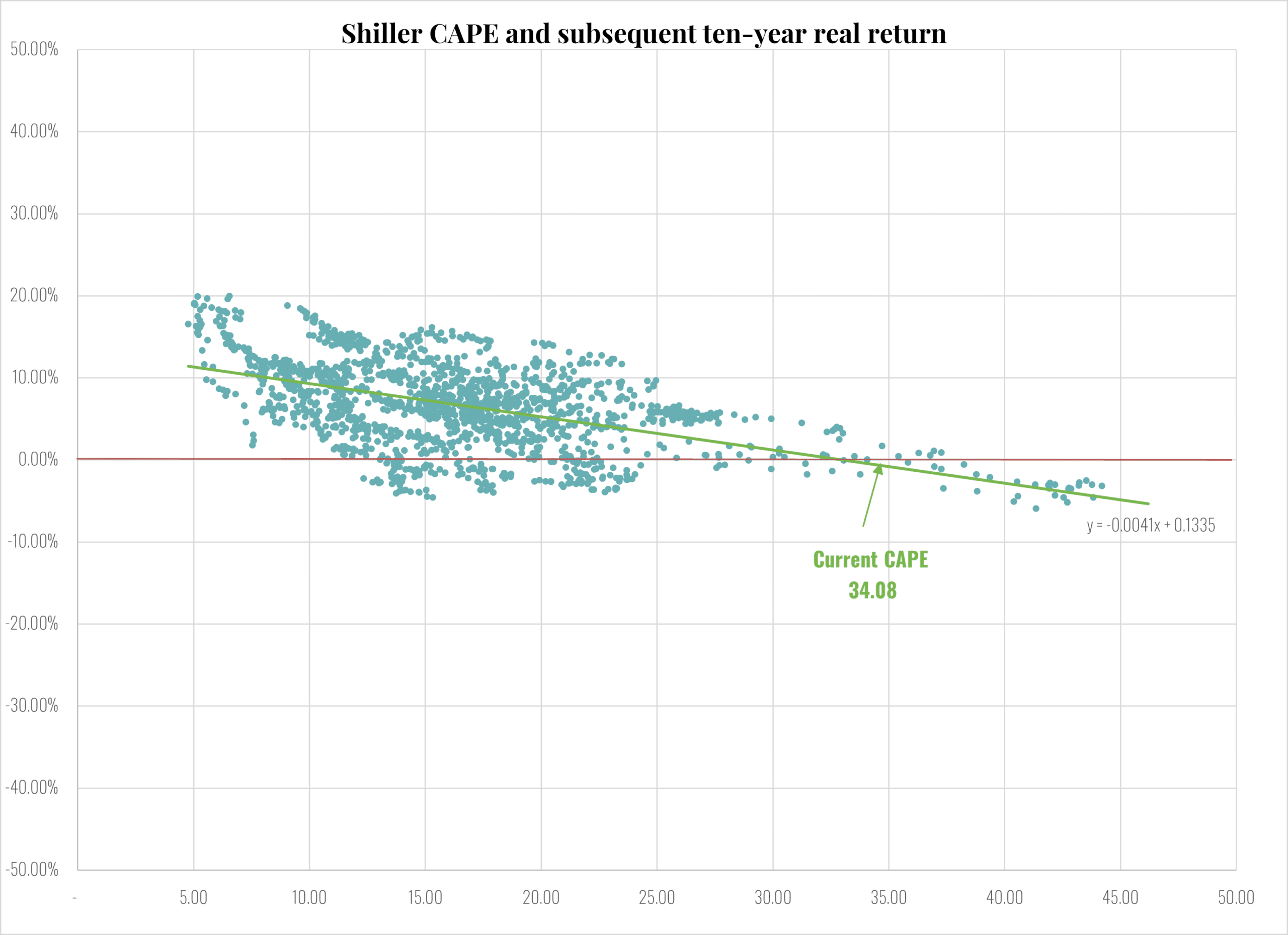
To interpret the charts, first look at the regression lines relating the CAPE to subsequent returns shown in green. In all three charts, the green line slopes down and the slopes are similar. That indicates that high CAPEs predict similar lower expected returns at all horizons. However, at the short horizon of one year the predictable part of the return is swamped by the annual variation in stock returns. As shown, the scatter plot is basically a random cloud. The R-square of the regression is only 0.04 indicating very little explanatory power. At five years, the relation between valuation and subsequent return becomes more clear. The downward sloping relationship between valuation and subsequent returns is visually evident and the R-square rises to 0.14. At ten years there is no mistaking the relation. The R-square is a respectable 0.27. Higher current valuations clearly presage lower future real returns on common stocks over the subsequent decade.
Given the greater explanatory power, the ten-year chart can be used to predict average annual real returns over the next decade based on the current level of the CAPE which is 34.08. At a CAPE of 34.08, the regression line predicts that average real returns over the next ten years will be approximately 0.0%. Assuming that the Fed will hit its inflation target of 2.0% over the next decade, this implies nominal returns on the S&P 500 of about 2.0%. That is less than the current yield of 4.2% on Treasury bonds. Needless to say, this is hardly an adequate risk/return tradeoff. One caveat, the foregoing assumes the historical relationship between valuation and subsequent returns persists and there has not been a structural change (as described in our recent publication).
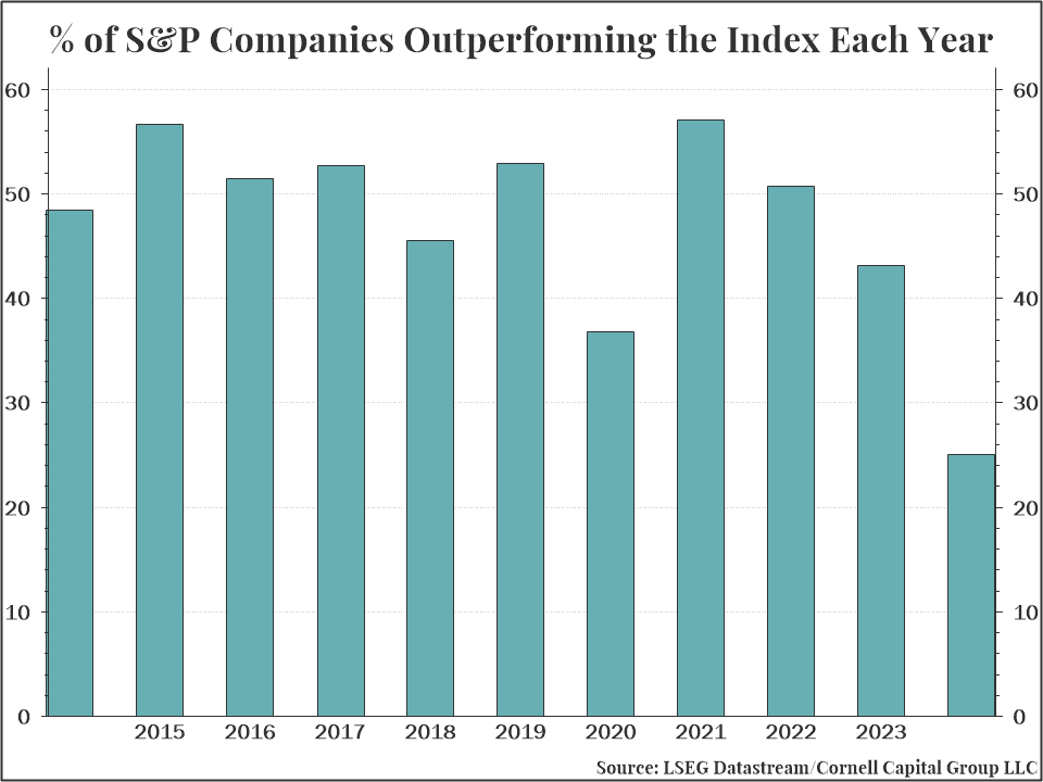
One thing that makes the bull market of the first half of 2024 somewhat unique is the low rate of participation. For instance, random chance would imply that approximately one-half of the stocks in the S&P 500 would outperform the index and for most of the last 50 years that has been largely true. But not in the second quarter of 2024. As shown in the chart below, in the first half of 2024 only 25% of the stocks in the S&P 500 beat the average. The big tech stocks pulled the market up so fast that a majority were left behind.
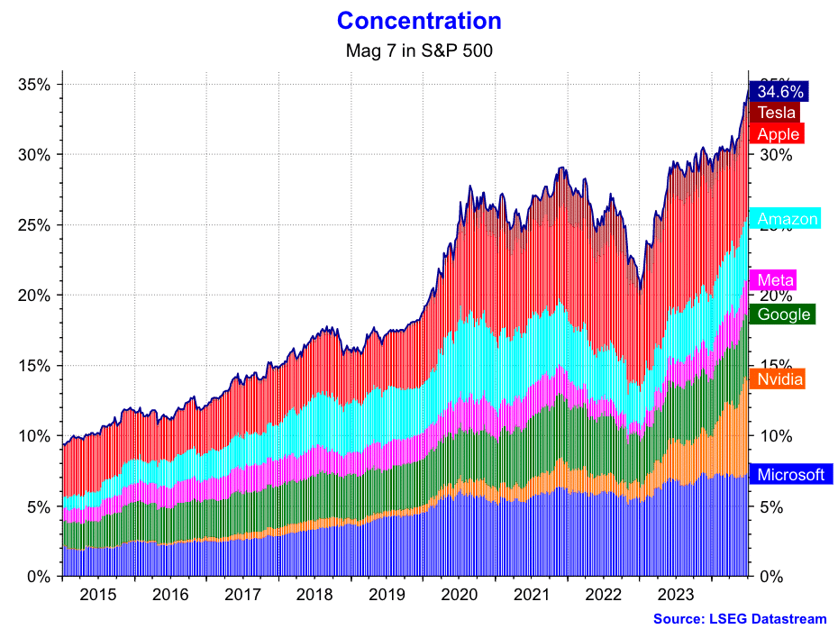
To highlight the impact of the performance of the Magnificent 7, the chart below plots their market capitalization compared to the market capitalization of the entire S&P 500 index in the decade from 2014 to 2024. Except for the downturn in 2022, the rise in concentration has been inexorable. The fraction of total market value attributable to the Magnificent 7 rose from about 9% in 2014 to nearly 35% by mid-2024.
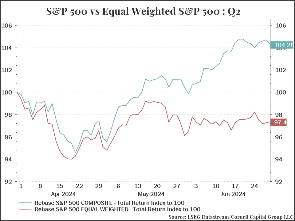
The dominance of the Mag 7 has led to a significant divergence between the return on the S&P 500 Index, which is valued weighted, and an equal weighted index of the same 500 stocks. As noted at the outset, and as shown in the chart below, the total return on the S&P 500 index 4.3% in the second quarter. However, an equal weighted index of the same 500 stocks fell 2.6%. This highlighted the extent to which the performance of the market was driven by the seven huge market capitalization technology stocks.
Valuation Is Not The Only Concern
Although valuation is a critical issue, it is not the only one that gives us heartburn. All the focus on the Fed and possible rate cuts has diverted attention from all the recession signals that continue to flash. We see a few indicators as particularly deserving of attention.
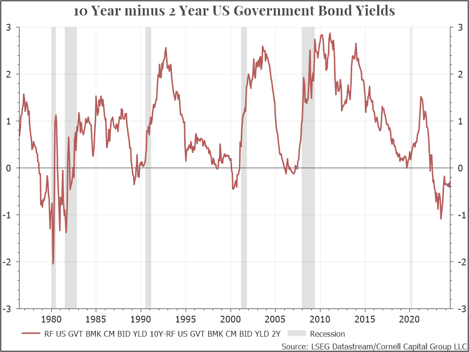
The first is the inversion of the yield curve. Under most circumstances, the yields on longer term bonds exceed those on shorter term bonds. For instance, the chart below plots the yield on the ten-year government bond minus the yield on the two-year government bond. As can be seen, most of the time the difference is positive. When it turns negative that is what referred to as an inverted yield curve. Notice that every time the yield curve inverted during the last fifty years a recession followed. The jury is still out on whether 2024 will be an exception, but it remains a red flag.
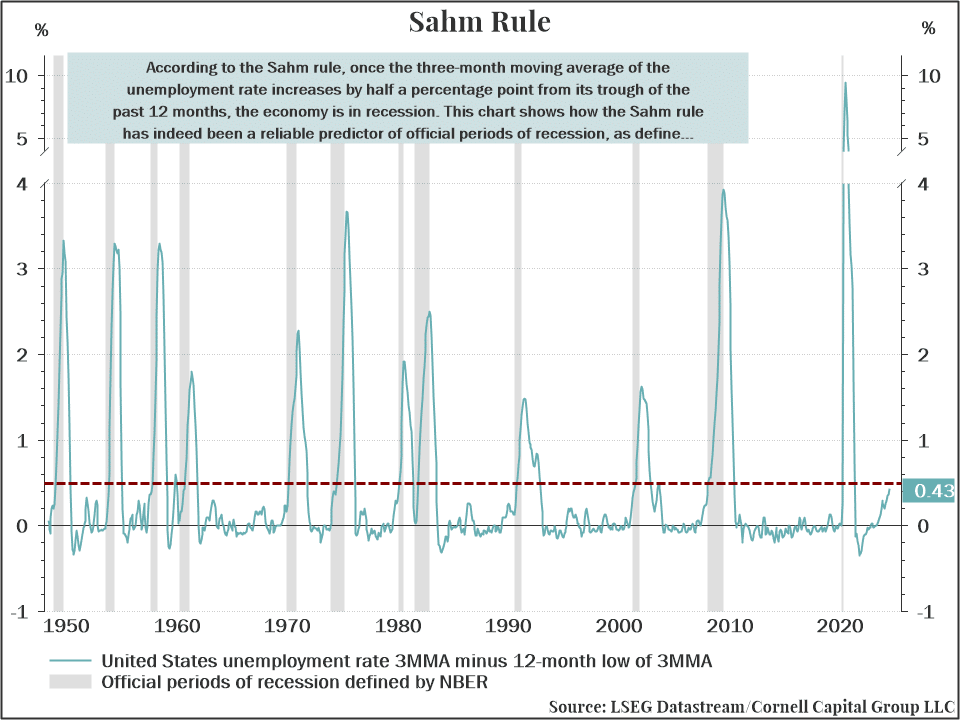
The Sahm Rule, based on the behavior of the unemployment rate, is a another widely used recession indicator. According to the Sahm rule, once the three-month moving average of the unemployment rate increases by half a percentage point from the trough of the past 12 months, the economy is in recession. The chart shows how the Sahm rule has been a reliable predictor of official periods of recession. Currently, the increase is 0.43% which is on the verge of crossing the 0.50% threshold which has signaled previous recessions.
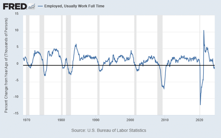
A related indicator is based on the percentage change from a year ago of fully employed people. When that percentage change turns negative it indicates that the country is entering a recession. As the chart below shows, the indicator turned negative in 2024.
All these indicators should be taken with a grain of salt. Perhaps this time will be different, and the economy will avoid a recession. But it would be foolhardy to ignore them entirely. They are yet another reason, along with stretched valuations, to follow a conservative, low-risk, investment strategy.
Conclusion
Forgive us if you think you have heard this from us before – you have. We view the continued rise in the market based largely on the performance of a handful of huge technology stocks as an unsustainable situation. This does not mean it could not continue for a while. If valuation was the driving force behind short-term market movements, we would not be where we are. Nonetheless, we believe valuation provides a long-run guide that should be heeded.
While valuation is our main concern, it is not our only fear. Numerous indicators, including the three that we presented, suggest that a recession could be on the horizon for the United States. If it does arrive, it is difficult to imagine stock prices remaining at their largely unprecedented valuations relative to CAPE.
The bottom line is that we believe the wise course is to take on less market exposure during the second half of the year, despite the continued run-up in the second quarter. If the market continues to advance as it did in that quarter, a more conservative strategy will underperform the S&P 500. Nonetheless we think that the risk/return trade-off favors that approach.
This memorandum is being made available for educational purposes only and should not be used for any other purpose. The information contained herein does not constitute and should not be construed as an offering of advisory services or an offer to sell or solicitation to buy any securities or related financial instruments in any jurisdiction.
